Client: easyJet Holidays    |    Timeframe: 12 weeks    |   My role: UX Researcher & Designer   
Team: Product owner x 2, project manager, project lead    |    Tools: MIRO, Figma, Teams
The research aimed to provide an initial insight into the Switzerland market before the first MVP site was launched and discover any glaring issues to be aware of. Given the limited time before the launch date, our objective was to engage with as many people as possible in the market to minimise risks of friction and enhance the likelihood of success. Any high-priority issues and quick wins could be addressed before the MVP launch, and further recommendations would be added to the backlog for future releases. 
I took charge of the research phase, which primarily involved exploratory research to understand the differences in holiday booking behaviours between the UK and Switzerland. Following this, I transitioned into the role of a UX designer, creating visual mock-ups based on the research findings.
Methodology
The six methods carefully chosen as part of the qualitative research program were designed to be complimentary, leveraging snowball sampling techniques to access participants in the market. The approach started with broad exploratory methods and gradually narrowed to more confirmatory ones.
1. Stakeholder Workshops
The project began with workshops involving key stakeholders from impacted areas such as PPC, merchandising, and finance. These sessions aimed to understand what the gaps in their knowledge were, and what they needed to know in order to position their product in the new market. This provided us with a list of questions that guided our research. ​​​​​​​
2. Competitor Analysis
To understand the market landscape, I conducted a thorough competitor analysis, to see how other key players positioned themselves in the market, and to analyse the differences and gaps in functionality between the UK easyJet Holiday site and the Swiss competitor sites. 
From this, I could see what competitors deemed important for users in the market, and where the gaps were with the existing UK site. This exercise discovered questions that were to be addressed later in the research. For example, I could see that most of the Swiss companies offered a payment method called TWINT, so I needed to explore how vital this was to Swiss people using a website. 

The competitive analysis allowed us to see what the existing market was doing in the space and identify anything we had not thought about. 
3. Guerrilla Interviews in Switzerland
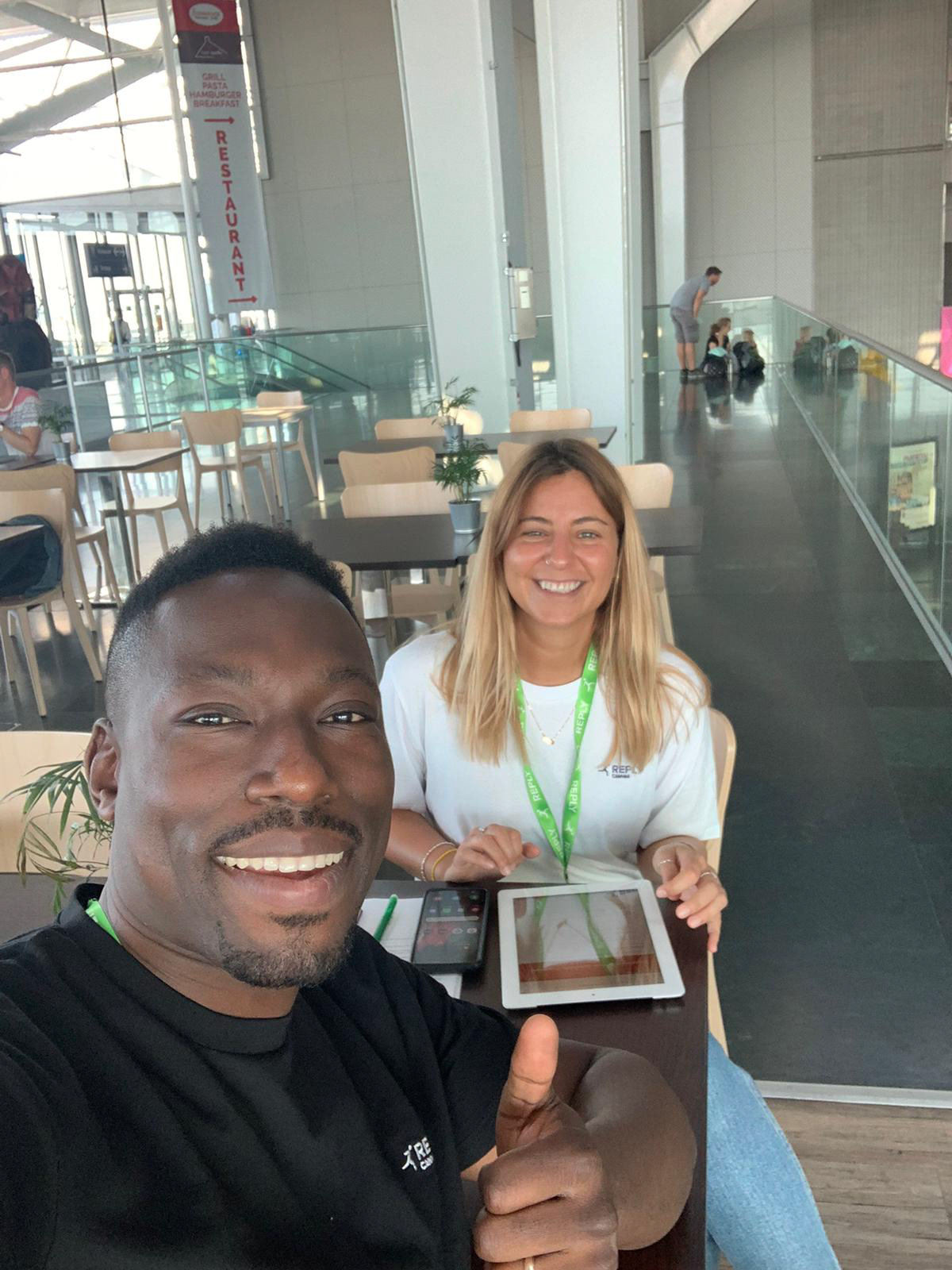
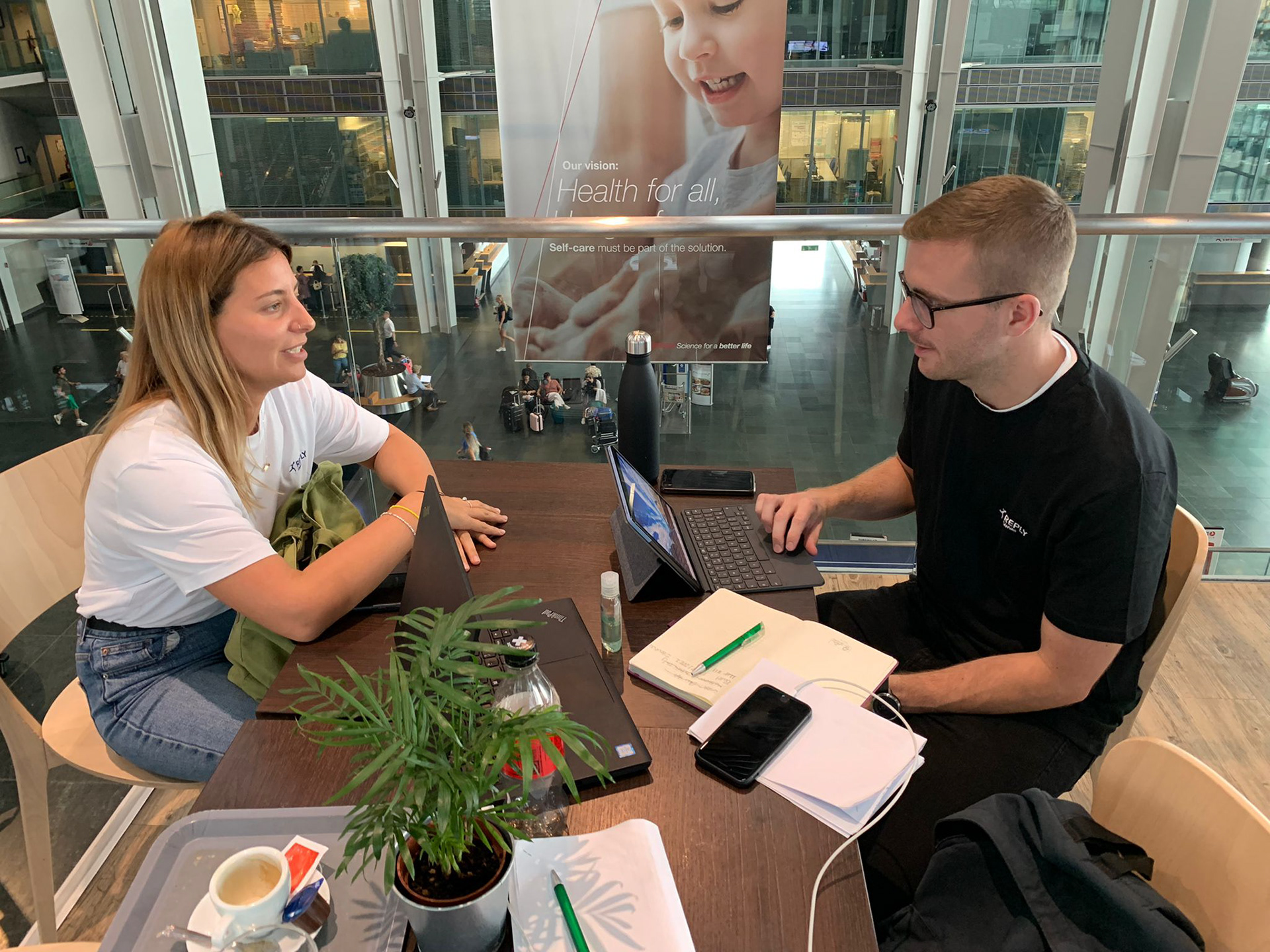
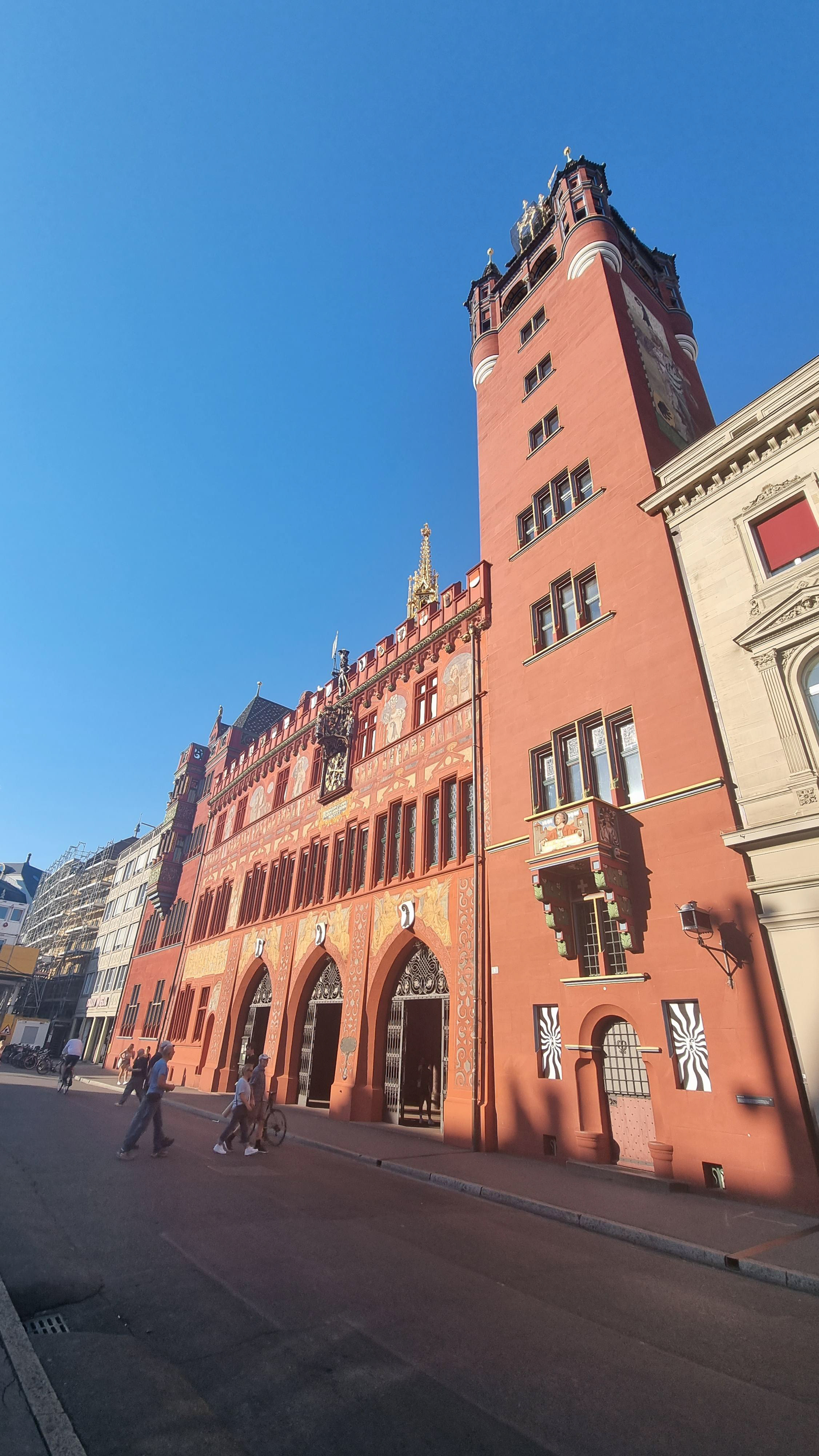
Given the exploratory nature of the research and the limited access to participants in the market, guerilla research was undertaken in airports and train stations in Switzerland, in order to gather insights and soundbites from the public about how they research and book a holiday. 
A team of 5 of us engaged with the public, asking open qualitative questions about researching, booking and paying for a holiday. Interested individuals were invited to participate in further incentivised research. These interactions provided me with invaluable firsthand insights and allowed me to dive deeper into the differences in culture and behaviour and understand more about the findings. 
One example was asking about the importance of TWINT as a payment method, as opposed to just debit and credit cards. Nearly everyone that we spoke to had heard of TWINT, and while they wouldn't avoid a website if it didn't have it as an option, it does make them feel that the website is more legit, and think of it as a standard in modern websites. ​​​​​​​
4. Competitior (TUI) Usability Testing
I ran a series of usability tests with 6 users on the close competitor TUI.ch's site to understand what users like and dislike on the booking flow, focusing on areas of difference, and learning the rationale behind the competitor's decisions.
For example, on their summary page, TUI included the option for the customer to finish and pay for their booking in a travel agency branch rather than online. The participants agreed that this was a legacy thing in Switzerland, and only rarely would their elder relatives choose this option. These sessions allowed me to collect insights into what is vital to include on our site, and what is not as important to our target audience. ​​​​​​​

Usability testing on the main Swiss competitor site gave me further insight into what is vital to the market and what is not as important. 

5. easyJet Holidays UK site Usability Testing
Following the competitor site usability testing, I used the data found in all of the previous methods to alter the current UK site prototype to make changes tailored to the new market, such as adding the language selector, adding some homepage choices, adding more information about the pricing and adding more options for payment on the summary page. 
I ran a series of usability tests on these altered designs with 5 Swiss users to get some early validation on how effective my changes were. This allowed me to test out some of the solutions to the issues that I had previously discovered, and identify any other issues they have, both with usability and customer experience of the UK site. By going through the booking flow end-to-end, I was able to ask users further about differences that I had seen in the competitive analysis. 

Usability testing on the altered UK site allowed me to test out some solutions identified in the research so far with the consumers in the new market. 

6. Focus Groups
In order to dive deeper into some of the unsolved questions that we had, a series of structured focus groups with groups of 6 Swiss people were arranged. Armed with a list of gaps in my knowledge, I was able to engage the group in conversations about key topics that I had found, such as the perception of package holidays. It was interesting to hear the groups harmoniously agree on some answers but express their differences in others. 
As the facilitator, I found all of the participants to be actively engaged in the session, with one even messaging after to tell me that he enjoyed the discussion. Incentivising the participants ensured that they turned up to the session, but an approachable and relaxed environment made them speak up. 

The focus groups allowed me to dig deeper into some of the topics that arose during the earlier research.

Analysis & findings

The findings from all of the research methods were added to a MIRO board and synthesised together. 

As the research progressed, I wrote up all of the findings from all of the research methods onto a MIRO board and used affinity mapping and thematic analysis in order to group the key insights and findings. 
Before continuing with the analysis, I invited all of the members of the team who had been a part of the research into a workshop to review the raw findings and the themes that I had extracted. This session proved invaluable as it allowed me to validate that I had interpreted their notes and quotes correctly, as they heard them directly firsthand from the users. It also provided me with their perspective of what they had heard, and any conclusions they came to themselves. 
Example insight 1: Cheap vs value
In the UK, when shopping for a holiday, in general we prioritise finding cheap holidays low-cost holidays and our holiday websites show flashy offers and deals to reflect this. While price was still a driver for Swiss people, they are less focused on finding the cheapest holiday possible and more on getting good value for what they are paying. Budget holiday competitors in Switzerland had homepages that focused rather on beautiful destinations and inspiration.
Some inital perceptions of the UK homepage during the usability tests were “cheap”, “deal focused”, and apprehension as it seemed too cheap to be true. 
A resulting recommendation and design change was for the homepage to have more of an imagery led design which focuses on the destinations, creating a sense of excitement and inspiration, and outlines the value to the customer rather than flashing the cheap deals and offers. 
Example insight 2: Geography
Due to the location of Switzerland and the borders that it shares, it is very common for Swiss people to get the train or drive to nearby holiday destinations (e.g. South of France, Tuscany). This is in contrast to the UK market who generally need to fly if they want to holiday in warmer weather. Many Swiss people can drive to the mountains and lakes in the area, or go on ski holidays close by. They find this quicker, cheaper as there are no flights to pay for, and more environmentally friendly.
A resulting recommendation was that the Swiss proposition would benefit more from focusing on popular beach and city destinations that are not accessible by car or train (e.g. Greece, Canary Islands). Mountain, lake and ski holidays are accessible nearby in Switzerland and wouldn't be as attractive as a package holiday for the audience there.
Example insight 3: Language
Swiss users expected the site to be in German by default with the 
option to change to French. All competitors offer German and French.
Users are also used to seeing Italian and English as options. Despite what the EJH merchandising team initially believed, Swiss German and Swiss French were not expected to be language options on the site, and are not used by competitors. 
As most Swiss people are multi-lingual, they generally browse in whichever language is the default when they land on a site. They will then switch to their own language when they need to ‘do the serious stuff’ such as payment.
The resulting recommendation was to implement a language picker that allows the user to easily translate the Swiss site into German and French, and later Italian and English. Users need to be able to change the language at any point in the booking flow, and not get taken back to the homepage, which was a frustration on the competitor site. 

Insights from each research method were presented back to the immediate project team to keep them in the loop with findings and allow them to contribute more questions.

Outputs & Reflections
- Clickable prototype of full booking flow outlining full backlog of proposed changes from the research, prioritised by user impact and technical effort 
- Persona pack of Swiss consumers
- Discovery pack and final presentation to the wider project team and stakeholders addressing original stakeholder questions
The MVP site has since had a successful launch in the Swiss market, with many of the recommended design changes currently live on the site such as:
- Consistent and futureproof language picker accounting for both language and market
- An emphasis on further destinations that cannot be accessed easily by road
- Priority of value-add content rather than low-cost promotion
- More of a break-down of costs when paying so that users can see transparently what they are paying for
 The remaining recommendations were added to the backlog to be released in future sprints. 
Reflection 1: Guerilla Research
The guerilla research was a really great method for exploratory research as it allowed me to enter the market with almost no prior knowledge. However, I was new to this method in public and had pressure from the business to talk to a certain number of people to make the data significant. Unless the project has a very large budget and resources, then the data will never be significant to the whole market. In the future, I will always execute this method with purely qualitative questions rather than any quantitative ones. 

Reflection 2: Recruitment Diversity 
Throughout the research, I spoke to many members of the public, however, the sample was limited in diversity. The data was presented with a lot of caveats. I only reached those who could speak English due to being unable to access a translator, and those who were early enough to their flight in the airport or had spare time in the station. In the future, I will push for more budget for recruitment, in order to have a more diverse portfolio of participants. 

You may also like

Back to Top